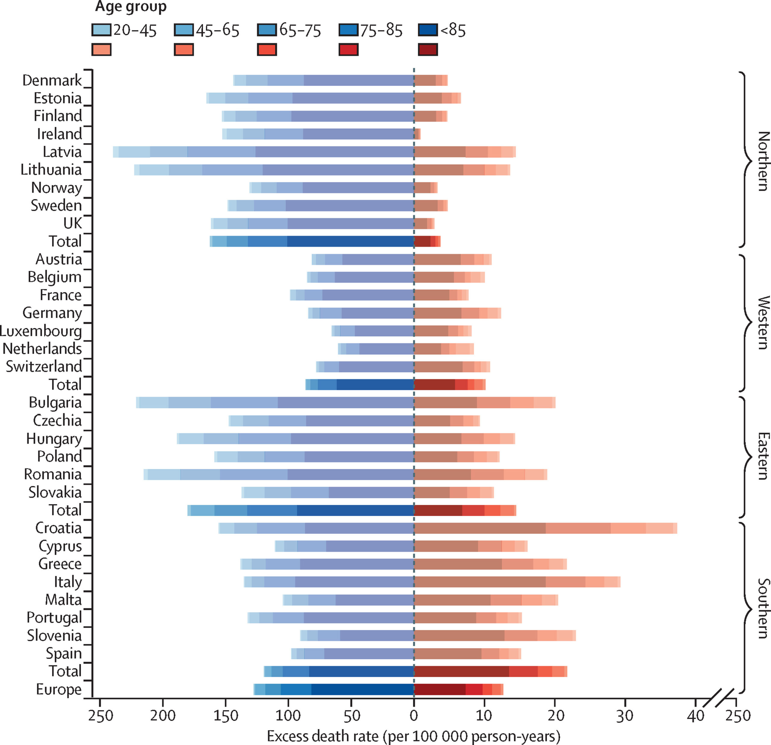
A whole lot of authors wrote a recent piece in Lancet, the well-known British medical journal, on deaths from cold and deaths from heat. The above is one of the key graphs they present. Deaths from heat are in red; deaths from cold are in blue.
Quick question: What is the approximate ratio of deaths from cold to deaths from heat?
I highly recommend that you answer before reading on.
I knew that the ratio was very high because I’ve studied the data in the past. And indeed, in their findings up front, the authors write:
Across the 854 urban areas in Europe, we estimated an annual excess of 203 620 (empirical 95% CI 180 882–224 613) deaths attributed to cold and 20 173 (17 261–22 934) attributed to heat. These corresponded to age-standardised rates of 129 (empirical 95% CI 114–142) and 13 (11–14) deaths per 100 000 person-years. Results differed across Europe and age groups, with the highest effects in eastern European cities for both cold and heat.
But many people are “visual.” They will look at a graph and not look carefully. If they see that line A is way bigger than line B, they will assume that the magnitude of A exceeds the magnitude of B by a large margin.
In the graph above, you will see, if you look carefully at the axes, that this is not what’s happening. The distance that measures 10 for deaths from heat measures 50 for deaths from cold.
HT2 Daniel Klein, who sent this link.
Update: As the first 3 commenters pointed out below, I misstated the question. It is now fixed.


